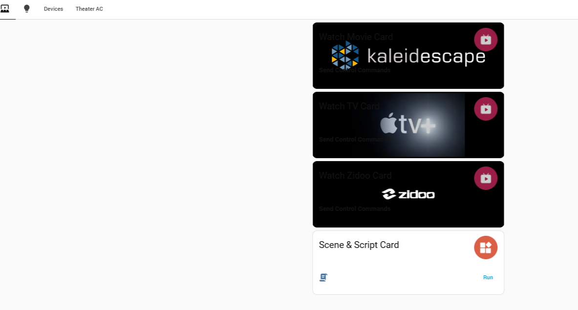
It would be nice to have ability to have background images for view as well as other cards like we do for the TV card. i.e buttons, scenes, etc.
1 Like
Hi Rafael_Smith,
Thanks for the suggestion — it’s a good one! As you pointed out, we currently support background settings for the TV Card and Scene Card. We definitely agree that this should be extended to other cards as well in future UI updates.
I’ve logged your request and will pass it along to the team.
Appreciate your input!
Wanted to add that the update to v4.1 seems to have changed the way background images for the TV Cards are rendered. Not sure how to describe them but this is pic of what they looked like with v4.0. With v4.1 they are “scrunched”…i.e the image of kaleidescape and the label “Watch TV” are on top of each other…The zidoo one is scrunched to much cant even tell what it is.
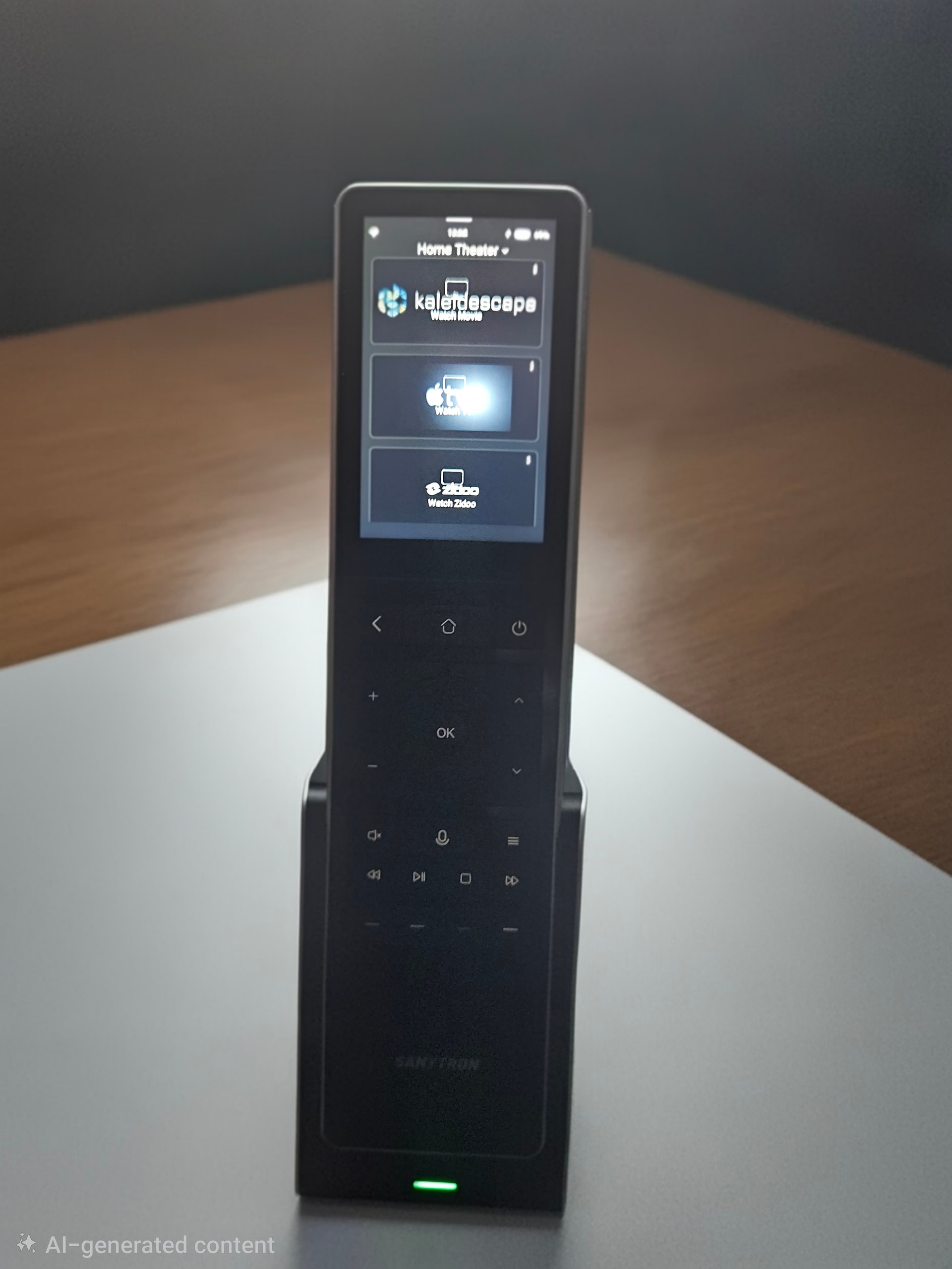
If the image appears stretched, it may be because the provided image size is too small. You could try cropping the image to a larger size. Hope this helps.
In the meantime, we will also run some tests on our side. I’ll let you know once we have more information.
My point was that i did not change the image…i had it looking correct in 1.4…but once i updated to 1.41 it somehow changed.
Hi,
We just tested this on our end and couldn’t reproduce the stretching issue in the new version (we used a 998×352 image). If you don’t mind, could you send us the image you’re using so we can test it directly? That would help us figure out what’s going on.
Thanks!
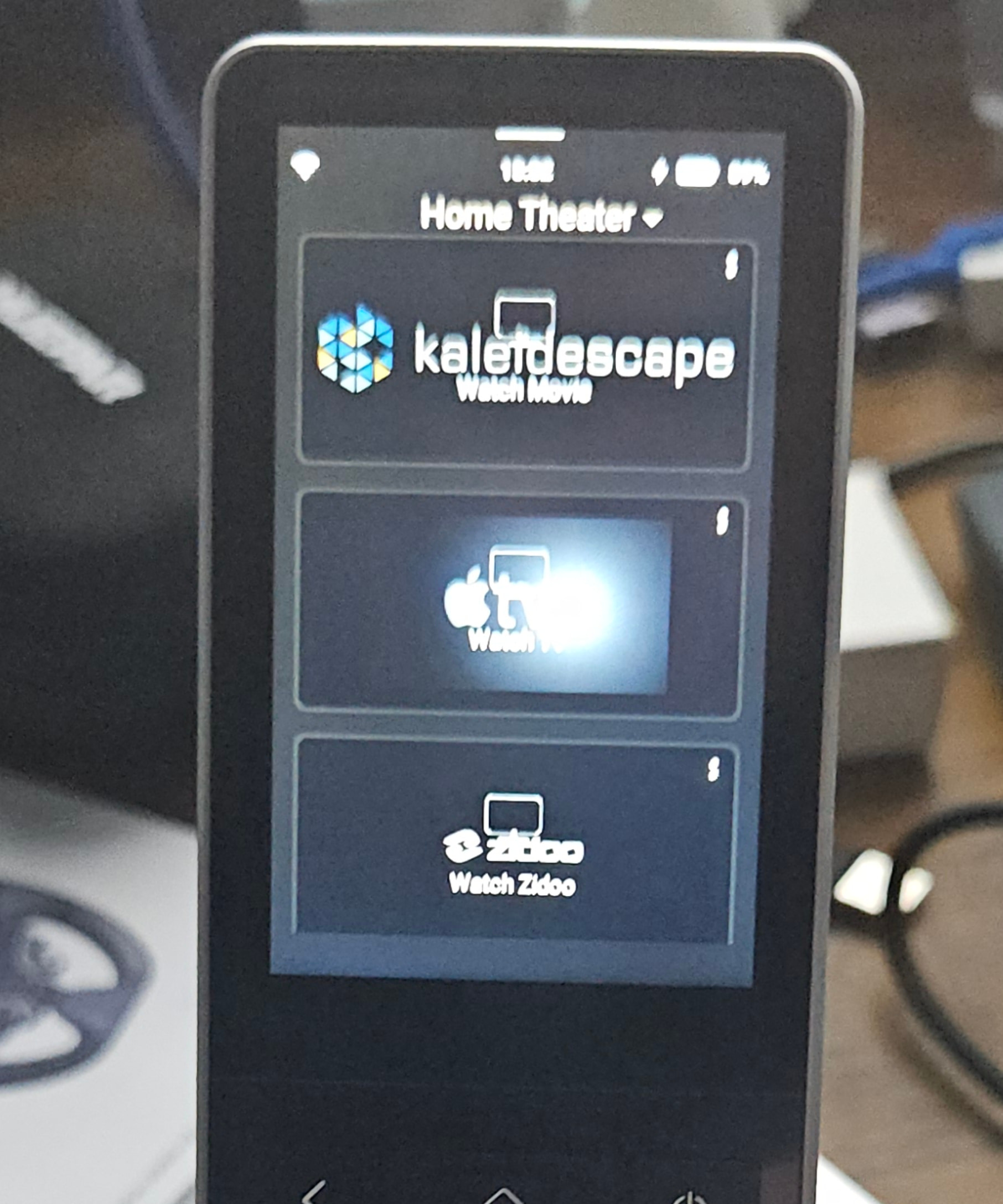
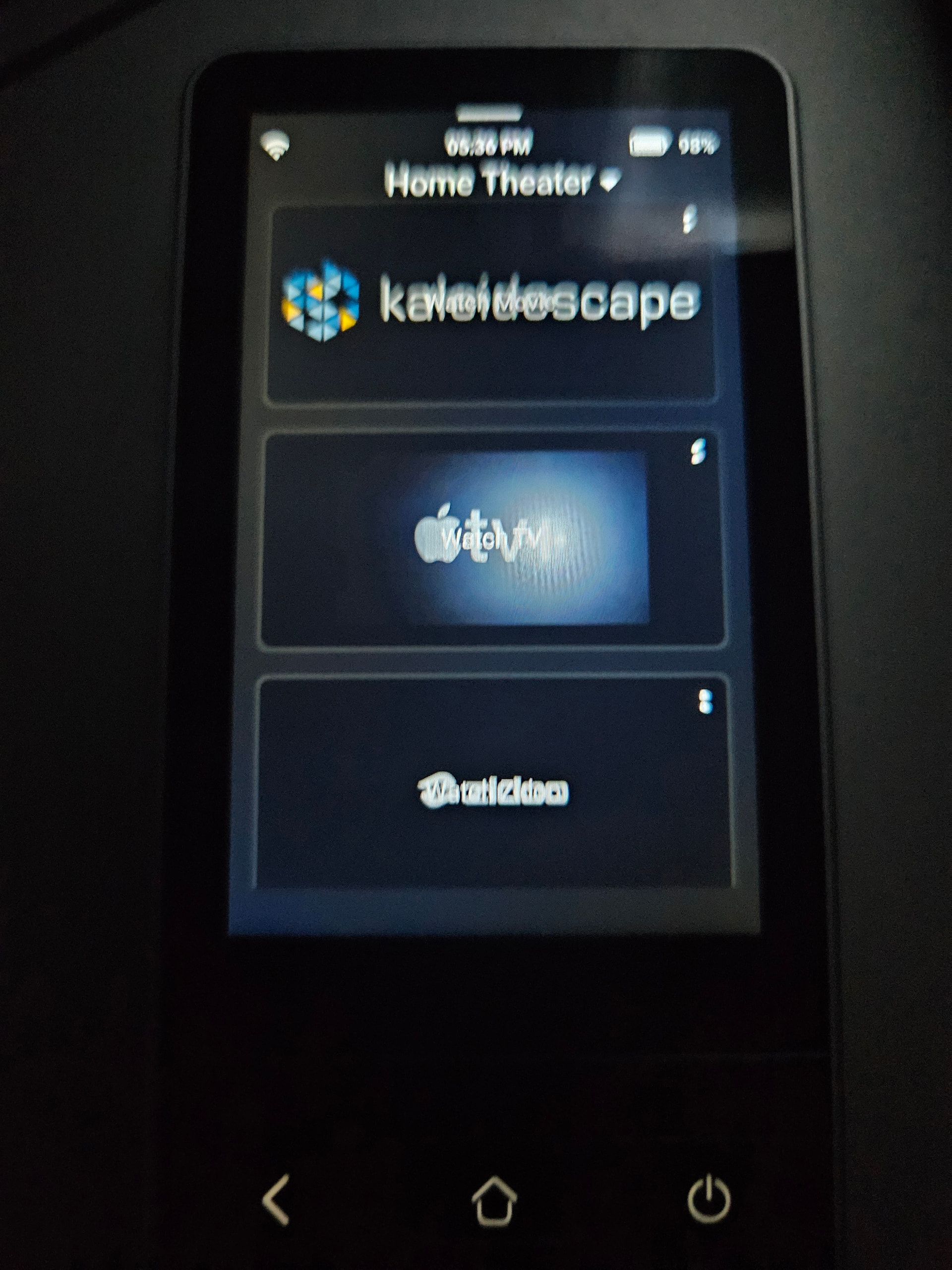
I did not change anything just upgraded the remote from 1.4 to 1.41 and did refresh. Looks like its the position of the card name that moved?
1.4:
1.41:
Curious, is it possible to not display or adjust the position of the card/device name?
Ah, I see what’s going on now! In v1.4.0, we showed both the icon and the name, but we thought that didn’t look great with backgrounds, so in v1.4.1 we removed the icon and centered the text. Since your background image is centered too, they end up overlapping — hence the issue.
Going forward, I’ll suggest to our team that we add a toggle so users can choose whether to show/hide the name and icon. That should make it cleaner and more flexible.
Thanks for the feedback!
That would be great.
Out of curiosity I decided to try setting the TV Cards name to all spaces…which made my images look like how I wanted however messed up the navigation events I was using to tell the Astrion to switch to a specific TV Card…so a option in the ROS TV Card configuration to not display the name would really be welcomed…so the navigation events/action still work.
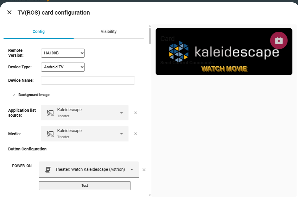
Okay, I see. The overlap between the name and the image is indeed an issue. I will report this to our internal team and check if there’s a way to resolve it in the short term. We’ll continue to improve the experience here step by step going forward. I hope you can understand.
Just like to +1 this please, it would be amazing to get consistent background images for all cards.
Yes, this is something we are actively considering right now. There are a few development details we need to work through as a team, but please don’t worry—we hear you!
The future of the Astrion Remote is definitely heading towards a more diverse experience. Thanks for your patience and support!